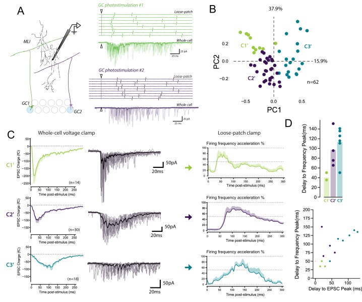
Figure 7. The diverse profiles of STP of GC boutons differentially shape the spike output pattern in the target MLI.
(A) Left panel, schematic representing the design of photostimulation in the granule cell layer. Open circles represent the sites where RuBi-glutamate was uncaged and the blue circles represent the locations where photostimulation elicited responses in the recorded MLI. In this example, 2 GCs localized at distal positions in the granule cell layer contact the recorded MLI. Right panels, representative experiment showing the spike output pattern recorded in loose-patch configuration and EPSCs recording in whole cell configuration in the same MLI following photostimulation of two different locations in the granule cell layer. The white arrowheads and dashed lines represent the onset of photostimulation. Note that the onset of firing is time-locked to the first peak of EPSC charge for photostimulations in location #1 (upper panels) while the onset of firing was more variable for photostimulation in location #2 (lower panels). (B) PCA transformation of the evoked charge time course for 63 unitary contacts (see Materials and methods). The EPSC bursts could be differentiated depending on their tonic or phasic component into three different clusters using k-Means clustering analysis. (C) Representative traces of EPSCs and of the corresponding firing profiles recorded in singles MLI following stimulation of C1’, C2’ and C3’ connections. (D) The delays separating the onset of photostimulation and the time the recorded MLIs were firing at their maximum frequency (referred as delay to frequency peak, recorded in loose-patch configuration) and the delays separating the onset of photostimulation and the time EPSCs are reaching their maximum value (referred as delay to EPSC peak, recorded in voltage-clamp configuration) were measured for 12 GC-MLI synapses for which we were able to correlate the spike output pattern with STP profile (C1’, C2’ or C3’). Upper panel, the bar plot shows that stimulation of C1’ connections led to faster accelerations of MLI firing rate than stimulation of C2’ and C3’ connections. Lower panel, the scatter plot shows a clear correlation between the delay to EPSC peak and the delay to frequency peak recorded. Each experimental point was associated with its STP profile by using the same color code for categories than in the upper graph.


