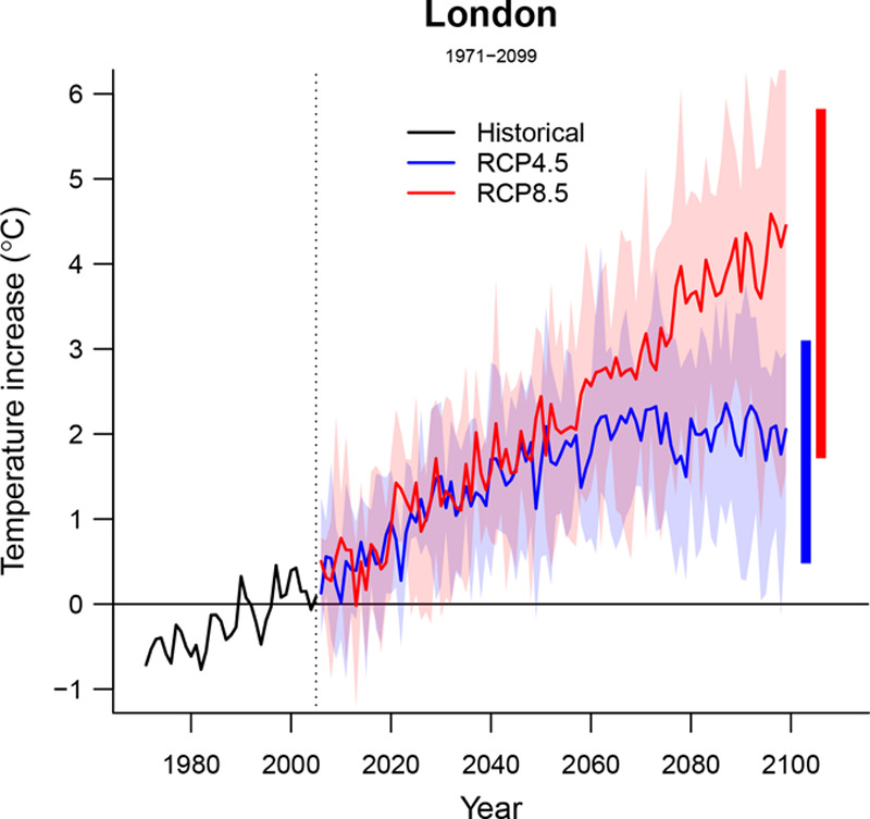
FIGURE 2.

Temporal trends in projected temperature in London (1971–2099). Solid lines correspond to the mean annual temperature estimated across the five GCM-specific modeled series. The shaded area shows its variability, corresponding to the range for each year. The two horizontal bars in the right correspond to the average annual maximum and minimum for each modeled temperature series. Representative concentration pathway (RCP).
