
FIGURE 3.
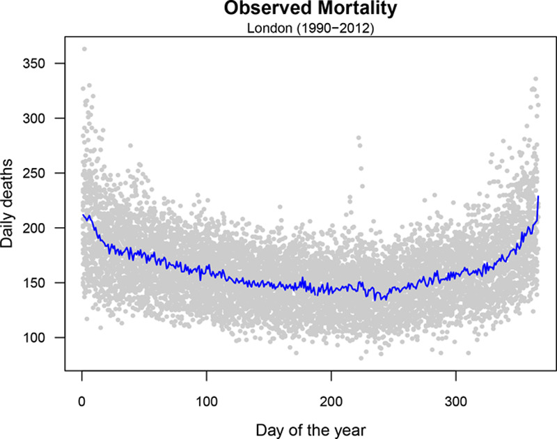
Seasonal mortality trends in London. Gray dots correspond to the observed daily mortality counts registered in each day of the year between 1990 and 2012. The blue line depicts the mean number of deaths per day of the year.
Official websites use .gov
A
.gov website belongs to an official
government organization in the United States.
Secure .gov websites use HTTPS
A lock (
) or https:// means you've safely
connected to the .gov website. Share sensitive
information only on official, secure websites.
Seasonal mortality trends in London. Gray dots correspond to the observed daily mortality counts registered in each day of the year between 1990 and 2012. The blue line depicts the mean number of deaths per day of the year.