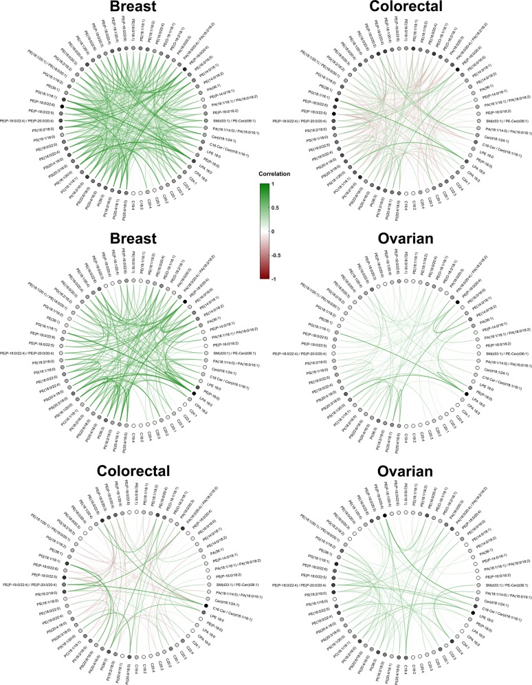
Figure 8.
Circle plots representing the correlation features that were significantly different in the three pairwise contrasts. Each row represents the significant correlations averaged across the MS images of the tissue class and the 500 repetitions. Positive correlations are plotted in green, whereas negative correlations are colored in red. Each dot represents the molecule ion involved in the colocalization feature, with a darker color for nodes that were involved in higher absolute average values of correlations. The graphs illustrate clear differences in colocalization patterns between the three tumor types.

