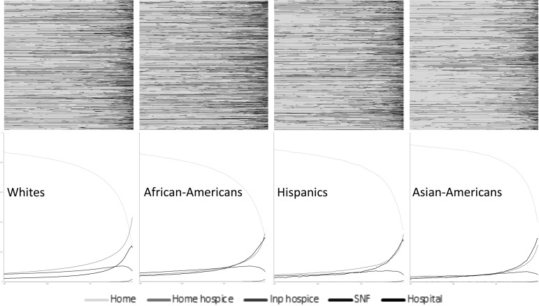
FIG. 2.
Transition heatmap in the last six months of life, for Medicare decedents by race. In the heatmaps, the x-axis captures time over the last six months of life, and the y-axis represents decedents' care transition pattern. Changes in colors indicated care transition; and the darker the heatmap, the more intensive the end-of-life care.

