
Figure 5.
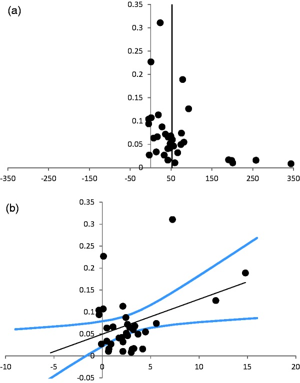
Assessment of publication bias. (a) Funnel plot of the studies on infarct size. The Y-axis shows the precision of each study defined as the inverse of the standard error (1/standard error). The X-axis shows the effect size per study. There is a clear asymmetry in the less precise studies, suggesting publication bias. (b) Egger regression of the studies on infarct size. The Y-axis shows the precision of each study defined as the inverse of the standard error (1/standard error). The X-axis shows the ratio between effect size and standard error (effect size/standard error). The black line is the linear regression line, with a 95% confidence interval (blue lines). The 95% confidence interval of the linear regression line does not include 0, which suggests publication bias.