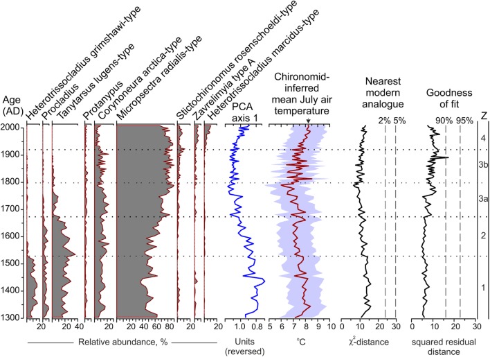
Fig. 2.
Chironomid diagram for MUT showing the relative abundance (%) of the most common taxa, the sample scores of PCA axis 1 and chironomid-inferred mean July air temperature plotted together with sample-specific prediction errors (SSPE, colored envelope). Boundaries between statistically significant assemblage zones (Z) as well as between subzones 3a and 3b are marked by dotted lines. Reconstruction diagnostic statistics such as nearest modern analogues for the down-core samples in the training set data, and goodness-of-fit of the down-core samples with temperature are indicated. Vertical dashed lines are used to identify samples with no ‘close’ (2%) modern analogues and samples with ‘poor’ (0.90) fit with temperature (see text for details). The black triangle indicates the elevation corrected instrumental average July air temperature (8.2 °C) from the weather stations Obergurgl–Vent and Sonnblick for the period 2006–2010 covered by the uppermost sample

