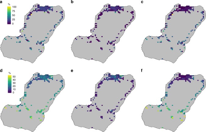
Fig. 2.
Travel prevalence on Bioko. The maps show the raw data (top row) and predicted surfaces (bottom row) as the percentage of people by map-area responding having traveled anywhere (a, d), to Río Muni (b, e) and within Bioko (c, f). Grey map-areas on the top row maps are those where no individuals were sampled in any of the three MIS due to low population. Note that the scale limits are different between the top and bottom rows. The noise introduced by sampling variance, illustrated by the extreme values of the top row, was smoothed out by the geostatistical models (bottom row). Source data are provided as a Source Data file

