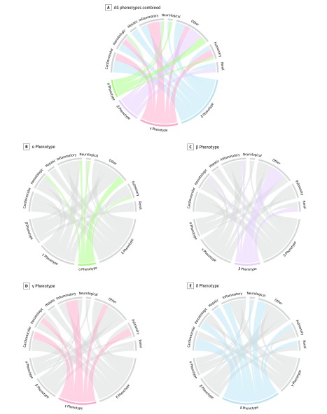
Figure 1. Chord Diagrams Showing Abnormal Clinical Variables by Phenotype.
In A, the ribbons connect from an individual phenotype to an organ system if the group mean is greater or lesser than the overall mean for the entire cohort. For example, the δ phenotype (light blue) is more likely to have members with abnormal cardiovascular and hepatic dysfunction (ribbons connect with these portions of the circle) vs β phenotype members (light purple) who are more likely to have kidney dysfunction and other abnormal variables (eg, increased age, comorbidity). In B-E, each phenotype is highlighted separately and the ribbons connect to the different patterns of clinical variables and organ system dysfunctions on the top of the circle.

