Figure 5.
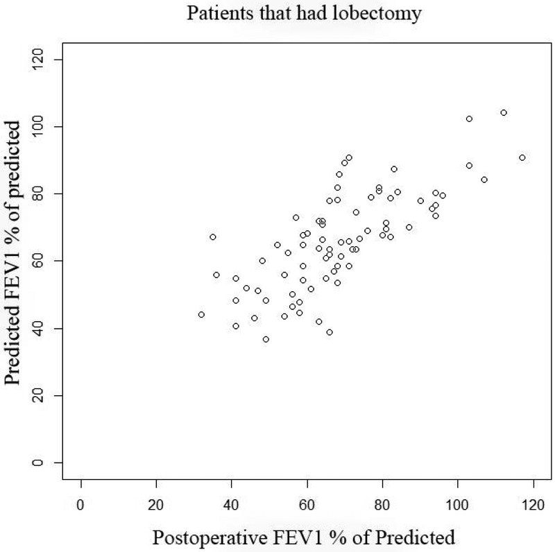
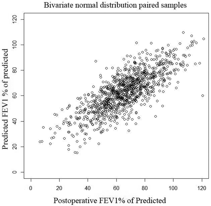
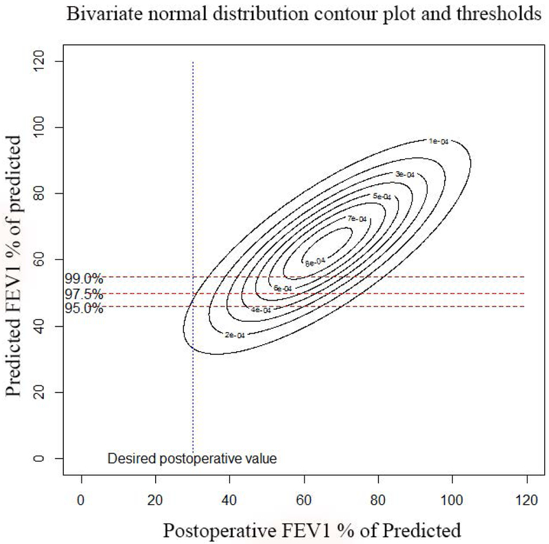
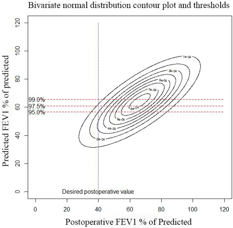
Actual postoperative FEV1 vs. Predicted FEV1 using quantitative perfusion scans: Panel A, (top left): Scatter plot of actual FEV1 vs. predicted FEV1 using Q scan for patients that had surgery. Note how the the original data demonstrates selection bias, as evidenced by the fact that there are very few patients with ppoFEV1 values less than 40%. Panel B, (top right): Random samples of 1000 pairs generated from the underlying bivariate normal distribution for predicted and observed values. Note that the truncation of the normal distribtution due to selection bias has been corrected. Panel C, (bottom left): Contour plot of underlying bivariate normal distribution. For a desired actual postoperative value of 30%, a given minimum threshold predicted value can be calculated, depending on the level of clinical certainty required. The three horizontal lines represent values of clinical certainty at the 95%, 97.5%, and 99% levels. Panel D, (bottom right): Contour plot of underlying bivariate normal distribution. The desired actual postoperative value is now set at 40% with corresponding minimum threshold values.


