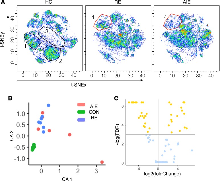
Figure 1. Data-driven analysis of the immunome shows major immune cell subset dysregulation in patients with neuroinflammatory epileptic disease.
(A) Cell subset distribution was visualized on a t-SNE map. Separate t-SNE maps for healthy controls (HC), refractory epilepsy (RE), and autoimmune encephalitis (AIE) groups were plotted. The x and y axes correspond to the t-SNEx and t-SNEy coordinates, respectively. Each cell is plotted as a dot, and the color indicates the density of cells. Blue dots and empty spaces indicate low cell densities, while green and red dots indicate high cell densities. The t-SNE plot was visualized in pseudo-color using FlowJo software. (B) Correspondence analysis (CA) to summarize the distribution of immune cell subsets (clustered using k-means clustering algorithms) as 2 principal components, CA1 and CA2, for each individual from the HC, RE, and AIE groups. (C) Volcano plot shows the result of statistical comparison between HC and NI group. The x axis shows the fold change (log2 scale), and the y axis shows the FDR values (–log[FDR]). Nodes above the horizontal line (yellow dots) indicate significantly altered nodes with a 10% FDR cutoff. Nodes left of the vertical line are reduced in frequency, while nodes on the right are increased in frequency.

