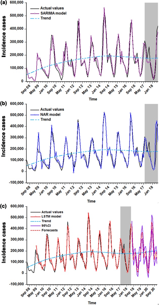
Figure 7.

The comparisons of in-sample simulations and out-of-sample predictions among these three models selected. (a) Comparison between the actual observations and the results from the SARIMA model. (b) Comparison between the actual observations and the results from the NAR model. (c) Comparison between the actual observations and the results from the LSTM model. The shaded area represents the validation sets from July 2017 to June 2018, in which the comparative results between the values predicted by the three selected models and the actual suggest that the curve forecasted by LSTM model is more proximal to the actual. As presented in (c), the red dotted line stands for the trends from July 2018 to December 2020 projected by the LSTM method.
