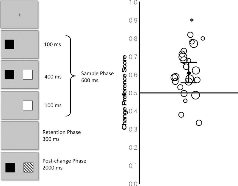
Figure 5.
Depiction of a single trial in Experiment 2 (left) and observed Change Preference Scores (right). Each circle in right panel represents the median preference score from a single infant; the individual values are scaled to reflect the number of trials completed and are scattered horizontally to make the individual circles easier to see. The black line within the cloud of circles indicates the mean of the preference scores, with the 95% confidence interval shown by error bars. * = p , >05 for one-sample t test against chance.

