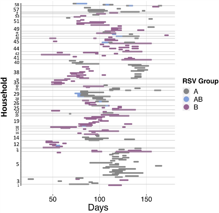
Fig. 2.
Shedding patterns for each of the 179 individuals who experienced at least one RSV shedding episode. The y-axis shows the household, time is on the x-axis with zero indicating the day before the first sample was collected. The grey dots show RSV A shedding, dark pink show RSV B and blue shows days of co-shedding. The horizontal grey lines separate the data by household. The study initially recruited 60 households but 13 were lost to follow-up, hence the numbering of the households goes beyond 47. (For interpretation of the references to colour in this figure legend, the reader is referred to the web version of this article).

