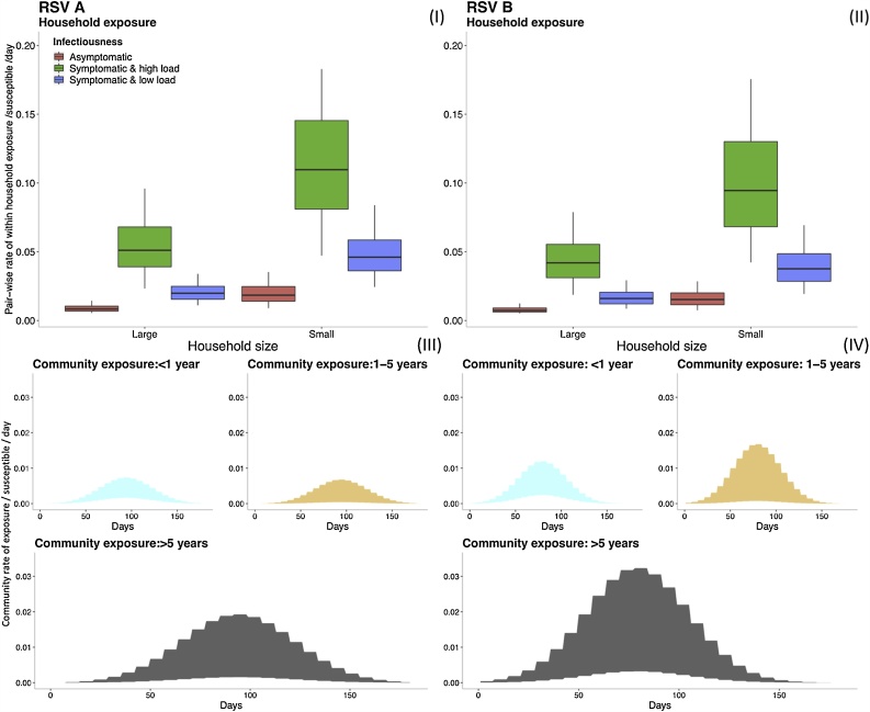
Fig. 3.
Comparing the range of within household exposure rate , (I) and (II), and community exposure rate , (III) and (IV), for a single susceptible individual given different heterogeneities in exposure and infectiousness. Top row: The box plots show the 0.025, 0.25, 0.5, 0.75 and 0.975 percentiles for the rate of exposure per person per day between a single susceptible and a single infectious housemate for RSV A (I) and RSV B (II). The distributions of rate are categorized by household size and the infectiousness based on viral load and symptom status (see text). Note: outliers have been removed from the box plots for better visualization. Bottom row: The shaded graphs show the range of values over time for the rate of exposure from the community to a single susceptible individual for RSV A (III) and RSV B (IV). The graphs are color-coded by the age group of the susceptible individual. The ranges for each age group are determined by the 95% CrI of the parameters that go into the calculations, hence the shaded regions show 95% CrI of the community exposure rate.

