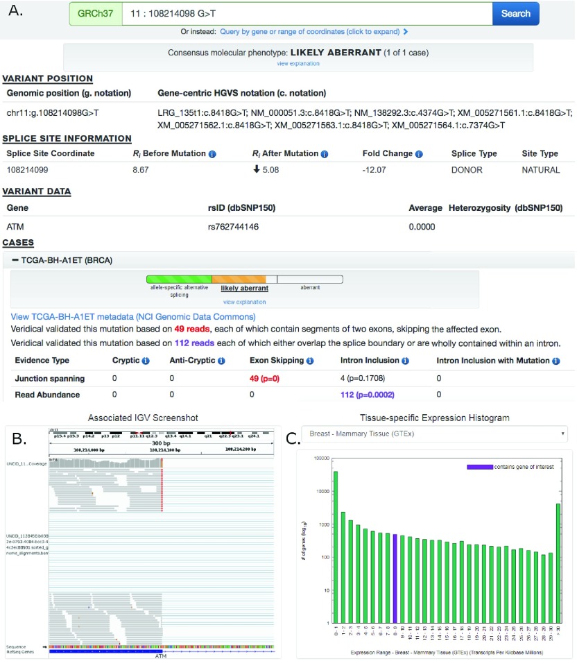
Figure 1. Screenshot of ATM:g.108214098G>T Results Provided By ValidSpliceMut Website.
( A) At the top of the page, the predicted molecular phenotype of the mutation for all cases is presented (prediction algorithm is shown in Figure 2). Then, the ‘Variant Position’ heading displays the variant of interest in g. notation, and provides a link which queries the Mutalyzer API to obtain the variant coordinate in a gene-centric c. mutation format. Variant-specific and splice site-specific tabular results are presented under the headings “Splice Site Information” and “Variant Data”. Results are then organized by TCGA and ICGC sample IDs (‘cases’) harboring the mutation within a series of expandable panels. A link is provided to patient tumor metadata on the GDC data portal. Each panel consists of the molecular phenotype classification for that particular sample, and the read counts and p-values for each Veridical evidence type. Significant p-values (≤ 0.05) are highlighted in bold. Evidence types deemed “strongly corroborating” (Viner et al. 2014) are color coded and correspond to the dynamically generated text appearing above the table. ( B) An integrative genome viewer (IGV) image showing alignment of expressed sequence reads. IGV screenshots are provided only for mutations present <1% of population (in dbSNP 150), with ≥ 5 junction-spanning reads, and are highly significant (p < 0.01) for cryptic splicing, exon skipping, and/or intron inclusion with mutation. A specific IGV screenshot for this sample captures the region surrounding the mutation. Here, several RNA-Seq reads show skipping of the affected exon. ( C) A dynamically generated histogram presents expression levels of all genes for a selected normal tissue type. Genes are grouped into bins based on expression level, denoted on the x-axis. The number of genes present in each bin is shown on the y-axis (log 10 scale). The histogram key indicates the expression range which contains the variant-containing gene (purple). Tissue type can be changed via a drop-down list.

