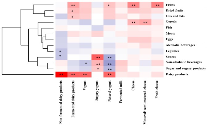
FIGURE 2.
Pearson correlation between the intake of major food groups (g/day) with fermented dairy foods (g/day) in the sample. Columns correspond to main fermented dairy products whereas rows correspond to food groups. Blue and red colors denote negative and positive association, respectively. The intensity of the color represents the degree of association between the fermented dairies consumed in the sample and major food groups in the diet. Asterisks indicate significant associations: ∗p < 0.05; ∗∗p ≤ 0.01.

