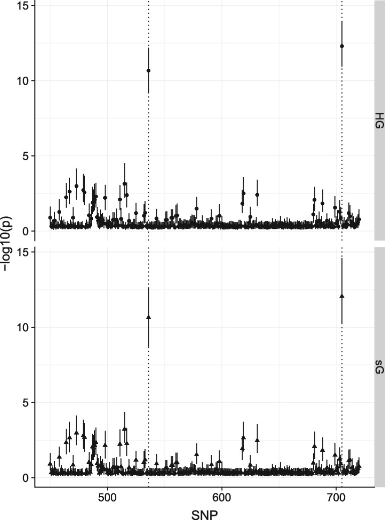
Fig. 1.
Results from simGWAS (sG) are visually similar to those from HAPGEN+SNPTEST (HG). The figure shows ∼350 SNPs from around the causal variants in the simulated region under scenario 4, with 5000 cases and 5000 controls. Points show the median −log10(P value) for each SNP, and ranges the IQR across 1000 simulations. Location of causal variants are marked with dotted lines

