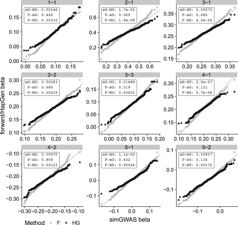
Fig. 2.
QQ plots comparing distribution of log OR at causal SNPs across 1000 simulations with 5000 cases and 5000 controls. Each plot compares the distribution of log OR generated by simGWAS (sG, x-axis) to that from HapGen+SNPTEST (HG) or forward simulation (F). Distributions were compared using Kolmogorov-Smirnov, and P values are shown in the top-right of each subplot. The label of each plot gives the corresponding ‘scenario-snp’ pair—i.e. the label 3-1 refers to scenario 3, first causal SNP

