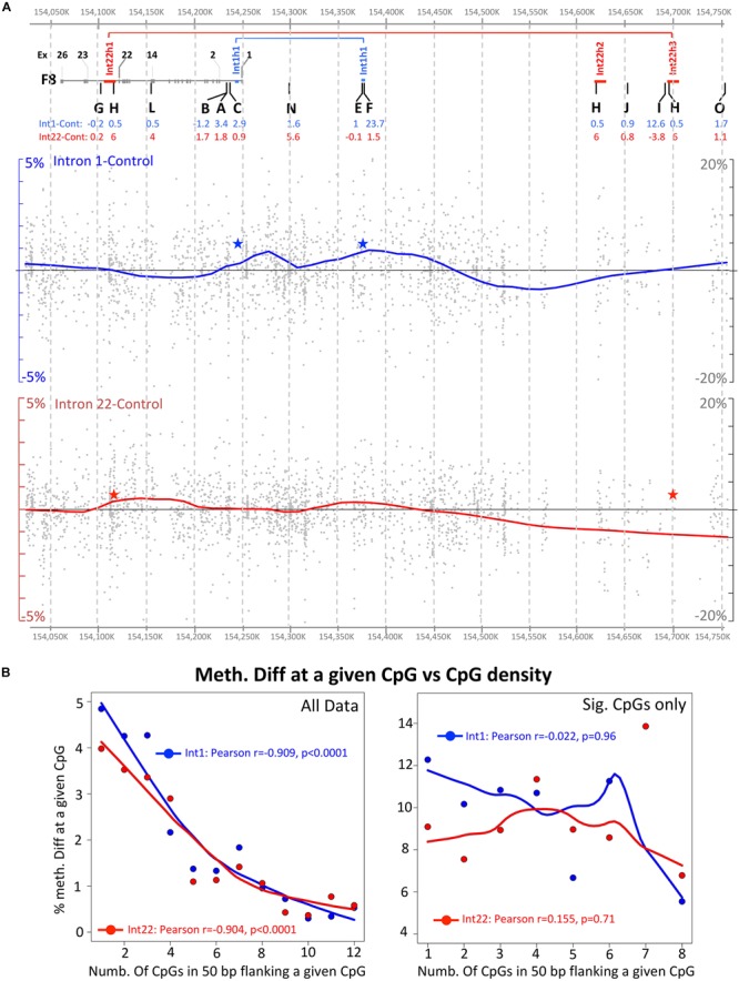
FIGURE 4.

Global visualization of NGS data in the F8 region (hg19: Chr X 154,027,275–154,751,861). (A) Upper panel shows the relative positions of the studied pyrosequencing regions, the middle panel shows the NGS data for intron 1 inversion samples and the lower panel the intron 22 inversion samples. The covered individual CpG methylation data are represented by a gray dot, while additionally, the data is represented by a smooth curve representing the trend of changes between the inverted and the control samples. CpG sites with less than 30 coverage or overlapping with known SNPs or repeats were excluded. Red and blue stars indicate the DNA inversion junctions. (B) Correlation between the methylation differences at a given CpG and the density of CpG within 50 bp flanking region. Left and right side include all CpG data and only significant data (Fisher’s exact test), respectively.
