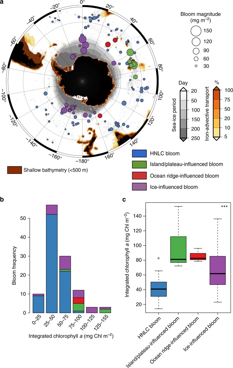
Fig. 1.
Phytoplankton bloom distribution, type and biomass in the Southern Ocean. Map (a) of the different bloom types (i.e., blue circles: HNLC; green circle: island/plateau-influenced; red circle: ocean ridge-influenced; purple circle: ice-influenced) sampled. The magnitude of the bloom (i.e., the maximum depth-integrated biomass) is related to the size of the colored circles. The gray dots indicate the individual float profiles. The red, orange, and gray zones are, respectively, shallow areas (>500 m), areas with downstream iron delivery (%; percent of iron remaining in a water parcel after scavenging relative to its initial concentration in shallow areas based on the Lagrangian modeling of horizontal iron delivery), and areas characterized by a seasonal sea ice cover. Histograms (b) of the frequency of and boxplot (c) according to the bloom type are displayed in relation to the bloom magnitude. In c, the top and bottom limits of each box are the 25th and 75th percentiles, respectively. The lines extending above and below each box, i.e., whiskers, represent the full range of non-outlier observations for each variable beyond the quartile range. The results of the Kruskal–Wallis H test are shown in panel c and depict regions with statistically significant differences between the magnitudes of the bloom at the 95 % level (p < 0.05). Asterisks (***) denote highly significant results (p < 0.0001)

