Figure 2.

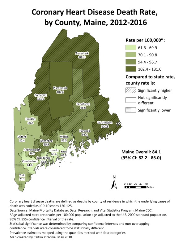
GIS map generated by the Maine Center for Disease Control and Prevention to show distribution of coronary heart disease death rates by county. Abbreviation: CI, confidence interval.

GIS map generated by the Maine Center for Disease Control and Prevention to show distribution of coronary heart disease death rates by county. Abbreviation: CI, confidence interval.