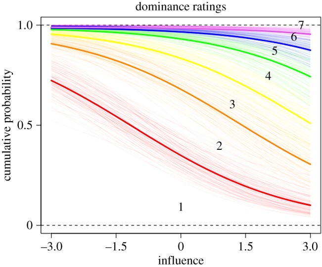
Figure 4.

Posterior predictions of the ordered categorical dominance model showing how the distribution of each Likert scale response varies with influence ratings. The lines indicate boundaries between response values, numbered 1–7, with thick lines indicating the mean prediction for that boundary. For example, the space between the orange and red lines marked with a ‘2’ indicates the relative number of participants who gave a rating of 2. The figure shows that if a participant has low influence, they are more likely to be given a low dominance rating (e.g. 1) compared to highly influential participants.
