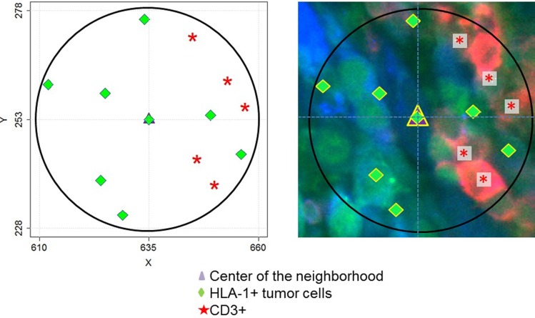
Fig 6. Cell neighborhood analysis algorithm (CNAA).
The map on the left demonstrates an example of a single neighborhood of a cell (purple triangle). X and Y coordinates are shown in microns and the diameter of the neighborhood is 50 microns in diameter. Green diamonds represent positions of HLA1+ tumor cells and red asterisks represent positions of CD3+ cells in the neighborhood. The MxIF image of the same neighborhood is shown on the left. Red: CD3 marker; Green: HLA-1; Blue color: S100B.

