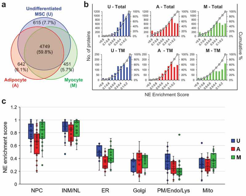
Figure 2.

Analysis of overall results from the proteomic analysis. (a) Venn diagram representing proteins detected in U, A and M cells and the overlap of the datasets. (b) Graphs plotting the NE enrichment scores vs number of proteins in U, A and M cells for datasets representing all proteins (Total) or datasets representing only annotated TM proteins (TM). (c) Box and whisker plots depicting NE enrichment scores for benchmark proteins of the NE, NL/INM and the cytoplasmic membrane compartments indicated in U, A and M cells. See Table S2 for scores associated with specific proteins.
