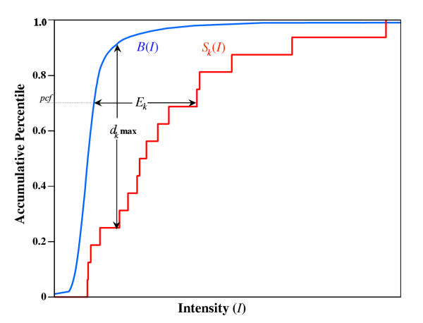
Figure 7.
Schematic diagram of the MOID algorithm. The blue curve is the integral intensity distribution of the non-probe-specific background data B(I) for the experiment. The red curve is the integral intensity distribution of a particular probe set, where each step represents the addition of one additional probe. The maximum vertical distance, dk max, is used in the P value calculation. The horizontal intensity difference, Ek, measured at pct captures the true signal for the set optimally.

