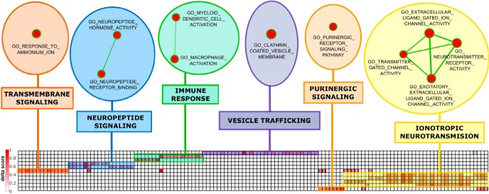
Figure 3.
Heat map of the clustered leading edge genes of the positively enriched gene sets. Rows correspond to the gene sets listed in Table 2 and columns correspond to their respective leading-edge gene as detailed in Table 3. Color coding from white to dark red reflects degree of relative upregulation (delta score). The upper part shows the enrichment map of the clustered gene sets, containing six different clusters representing the overarching functional pathways. Node size represents the gene set size and line thickness shows the degree of overlap (shared genes) between the two gene sets it connects.

