Fig. 2.
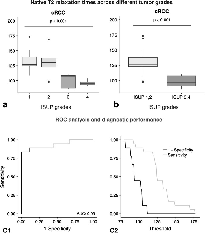
Distribution of T2 across different tumor grades (ISUP grades). The upper left part of the Fig. a displays the T2 differences across four different ISUP grades using boxplots. And the upper right part of the Fig. b shows the T2 differences across a two-tier-system (ISUP 1,2 against ISUP 3,4). Lower grade cRCC show higher T2 values compared to higher grade cRCC. The lower left part of Fig. C1 illustrates the diagnostic performance of T2 mapping as a binary classifier in discriminating between ISUP grades 1–2 and 3–4. In this context, the T2 threshold is varied using a receiver operation characteristic curve (ROC-curve). The corresponding Area under the Curve (AUC) is 0.93. The lower right part of the Fig. C2 displays the respective sensitivity and specificity values plotted against their corresponding threshold. The centerline in each box represents the median, whereas the lower and upper limits of each box represent the 25th and 75th percentiles, respectively. Whiskers extend to the most extreme observations within 25th and 75th percentiles ±1.5 x interquartile range. Observations outside these whiskers are shown as dots

