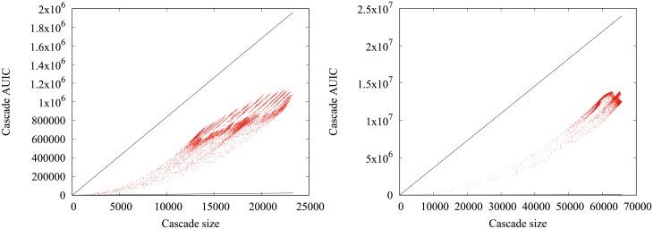
Fig 8. AUIC vs number of infected nodes (4-months, 1-year).
Comparative scatter plots of the cascade sizes and AUIC in the real data for quarterly (left) and yearly (right) cascades. Each point is a cascade of the sample. The black solid lines represent the theoretical boundaries outside which there is no cascade.

