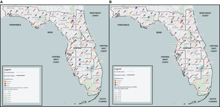
Figure 1.

Map of Pancreatic Cancer Incidence and Death Rates by Race/Ethnicity and Florida County. This map displays mean age‐adjusted A. incidence and B. death rates of pancreatic cancer for the years 2004‐2014 (pop std: 2000 US Standard) by Florida county for White, Black, and H/L Floridians (as reported by the Florida Department of Health, Bureau of Vital Statistics). Race/ethnicity groups are distinguished using red (White), blue (Black), or gold (H/L) dots of graduated sizes. Larger dots indicate higher average incidence or death rates. The peninsula is divided into seven geographic regions that were determined by Rosemurgy et al18 using the cost of living index and the urban to rural population ratio. H/L, Hispanic/Latino
