
Figure 3.
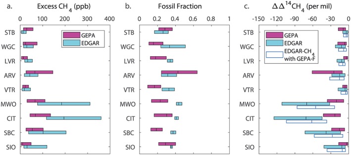
Distributions of excess CH4 concentration (left), fossil fraction (middle), and change in Δ14CH4 (right) in simulations using the GEPA and EDGAR emissions maps. Bars show the median and interquartile range (middle 50% of the data, between the 25th and 75th quantiles) for each variable at each observation site simulated in the afternoon for 2014 using CarbonTracker‐Lagrange. In the right panel, the change in Δ14CH4 is also shown for a simulation in which the excess CH4 concentration is determined using EDGAR but the fossil fraction is determined using GEPA.