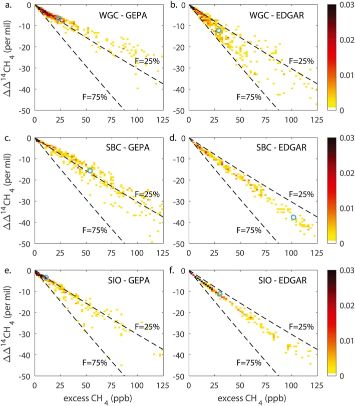
Figure 4.

Distributions of the simulated change in Δ14CH4 versus excess CH4 concentration, shown as two‐dimensional histograms at three selected sites. Other sites are shown in Figure S1. The top row shows WGC, middle row SBC, and bottom row SIO. Simulations shown in the left column use GEPA emissions, and the right column use EDGAR emissions. Colors show the fraction of the data contained in each bin. Blue circles show the median of the simulated change in Δ14CH4 and the median of the excess CH4 concentration in each case. Dashed lines show the relationship expected from constant fossil fractions of 25% and 75%, for reference.
