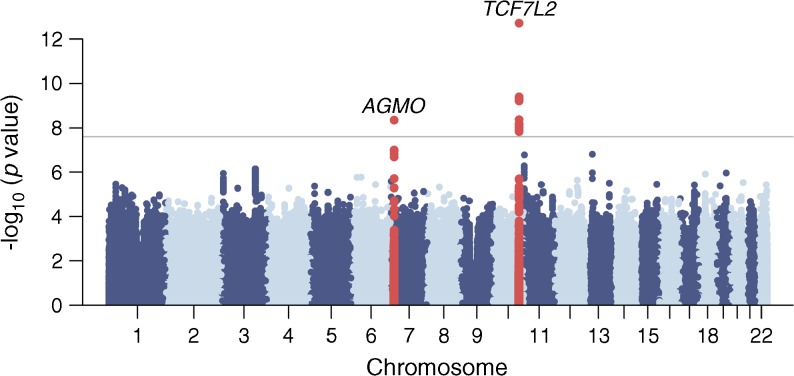
Fig. 1.
Manhattan plot of the type 2 diabetes meta-analysis results. The horizontal grey line corresponds to p=2.5×10⁻⁸ and loci reaching that significance threshold (variants within 500 kb distance of those with p<2.5×10⁻⁸) are shown in red. Gene labels correspond to the nearest/most biologically plausible gene

