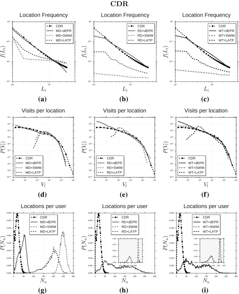
Fig. 4.
Distributions of human mobility patterns (CDR). The figure compares the models and CDR data on location frequency, visits per location and locations per users. Plots in (a–c) show the distribution of location frequency f(L) for d-EPR, SWIM and LATP used in combination with MD, RD and WT respectively. Plots in (d–f) show the distribution of the number V of visits per location and plots in (g–i) show the distribution of the number N of distinct visited locations per user

