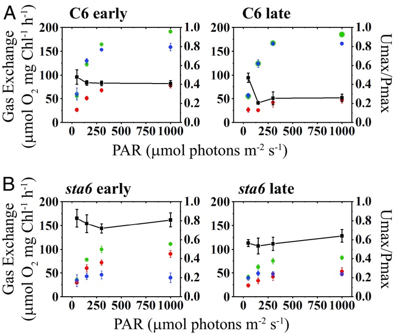
Fig. 3.
Maximal rates of light-induced O2 production and uptake. Maximal values for gross and net O2 production (green and blue, respectively) and gross O2 uptake (red) for C6 (A) and sta6 (B) are plotted as a function of light intensity. The left-hand y axis gives gross and net O2 evolution and gross O2 uptake. The right-hand y axis gives the ratio of maximal gross O2 uptake relative to maximal gross O2 production; this value is plotted as a function of light intensity (black line with black squares). For both A and B, the left panel presents the data for the first 3 min of the light phase and the right panel presents the data for the final 3 min of the light phase (i.e., early and late periods during illumination, respectively; see main text for details). Net O2 evolution was calculated as gross O2 production – gross O2 uptake. Each point is an average of at least three biological replicates ± SD.

