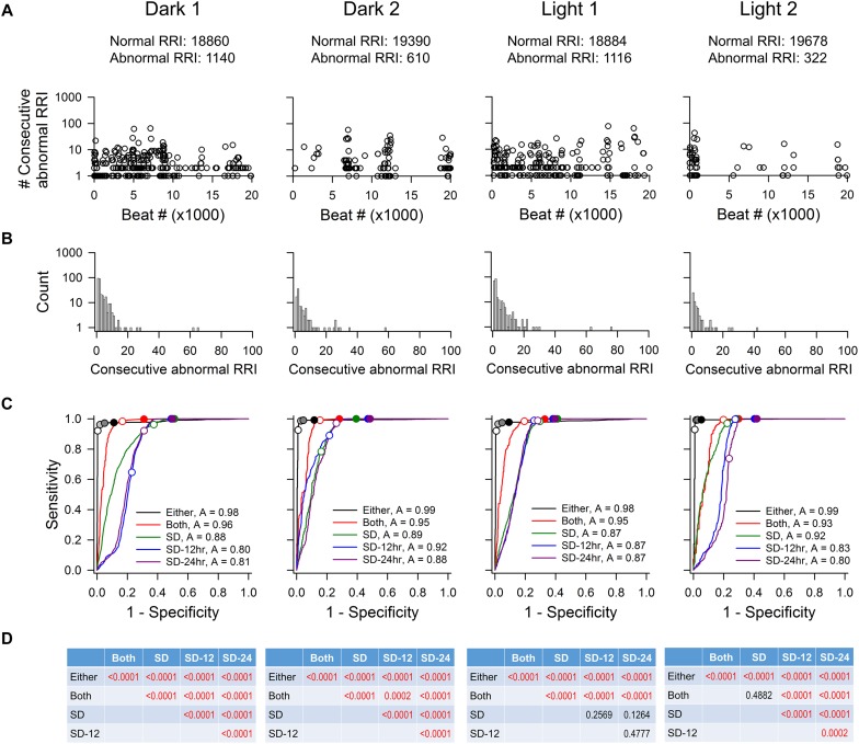
FIGURE 3.
ROC analysis of four time points (20,000 RR intervals in each time point) from rat recording 3. (A) Pattern of abnormal RR intervals throughout 20,000 beats. (B) Frequency histogram of consecutive abnormal RR intervals. Single and two consecutive abnormal RR intervals were the most frequent occurrences. (C) ROC curves showing that the “either” approach is significantly more accurate (highest ROC curve area) in identifying normal RR intervals with the least false positives. For the “either” approach, circles on the ROC curves represent 5% change (open circle), 10% change (light gray), 15% change (dark gray), and 20% change (black). For the “both” approach, open circle represents 5% change and closed circle represents 10% change. For the SD methods, open circles represent 1 SDs and closed circles represent 2 SDs. (D) p-values of pairwise comparison between exclusion methods. SD, SD generated from the 20,000 RR interval used for ROC analysis. SD-12 h, SD generated from the 12 h data of the same dark-light cycle. SD-24 h, SD generated from the whole 24-h data. The letter “A” in figure legend indicates overall accuracy of identifying normal and abnormal RR intervals.

