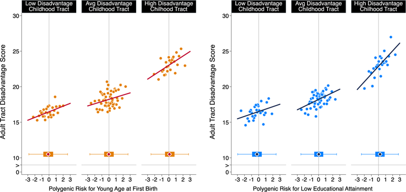
Figure 4. Age-at-first-birth and education polygenic score association with neighborhood mobility in the Add Health Study.

The figure plots polygenic risk associations with adult neighborhood disadvantage at the Census tract level for Add Health Participants who grew up in low-, middle-, and high-disadvantage Census tracts (n=5,325). For the figure, low-, middle-, and high-disadvantage Census tracts were defined as the bottom quartile, middle 50%, and top quartiles of the childhood tract disadvantage score distribution. The individual graphs show binned scatterplots in which each plotted point reflects average X- and Y- coordinates for a “bin” of 50 Add Health participants. The regression lines are plotted from the raw data. The box-and-whisker plots at the bottom of the graphs show the distribution of polygenic risk for each childhood-neighborhood-disadvantage category. The blue diamond in the middle of the box shows the median; the box shows the interquartile range; and the whiskers show upper and lower bounds defined by the 25th percentile minus 1.5x the interquartile range and the 75th percentile plus 1.5x the interquartile range, respectively. The vertical line intersecting the X-axis shows the cohort average polygenic risk. The figure illustrates three findings. First, adult participants tended to live in Census tracts with similar levels of disadvantage to the ones where they grew up. Second, children’s polygenic risks and their neighborhood disadvantage were correlated; the box plots show polygenic risk tended to be lower for participants who grew up in low-disadvantage tracts and higher for participants who grew up in high disadvantage tracts. Third, across strata of childhood neighborhood disadvantage, children at higher polygenic risk tended to move to more disadvantaged Census tracts no matter where they grew up.
