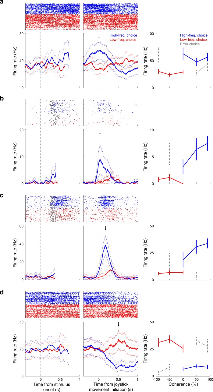
Figure 3. Neuronal sensitivity to choice in single vlPFC neurons.
(a–d) The left plots are raster and peristimulus-time histograms from correct trials only showing sensitivity to low-frequency (<0% coherence; red) and high-frequency choices (>0% coherence; blue). The thick lines indicate mean firing rate, and the dotted lines indicate the 95% confidence intervals. Data are aligned relative to stimulus onset. Gray circles in the raster plots indicate the time of onset of joystick movement. The middle plots show the responses of the same neurons but aligned relative to the onset of joystick movement. The arrow indicates the time of peak choice selectivity. The right plot summarizes each neuron’s firing rate during its peak firing rate ±100 ms: correct low-frequency choices are shown in red, high-frequency choices in blue, and incorrect choices in gray (only for coherences with at least five trials). Error bars indicate the standard error of the mean.

