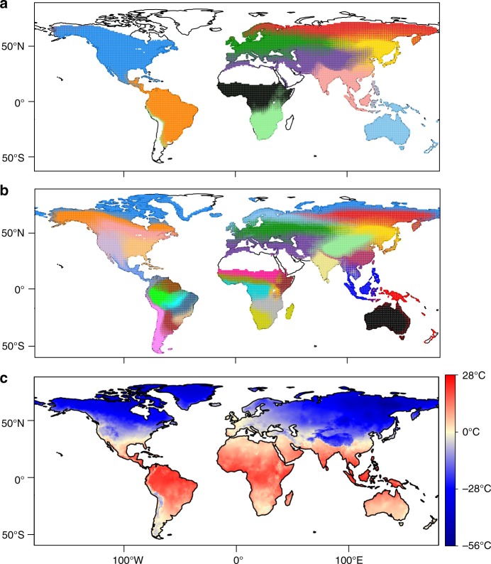
Fig. 1.
Species motifs for breeding birds. a K = 11 motifs. Pie charts represent the proportional contribution of species motifs to each 1° × 1° global map cell (i.e. ωnk). Colours represent the different motifs. Blank regions (no pie chart) contain relatively few species and are dominated by a motif that represents locations of low richness. This motif arises because of the dominance of the other ten clusters, which summarize the species composition of the majority of locations across the world. b Same as a but with K = 33. c Mean minimum temperature for the coldest month for each map cell (from worldclim.org43). The freezing line is indicated by the pale-yellow coloured cells. Note the correspondence between sharp turnover of species motifs in a, b and the freezing line in c. A high-resolution version of this figure, where the pie chart for each map cell can be clearly viewed, is available for download on figshare.com (https://figshare.com/s/2c3f5464cb1190e6602a)

