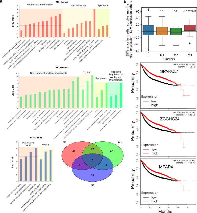
Fig. 4.
Functional annotations and survival analysis of M clusters. a Bar graphs show groups of related GO terms associated with each cluster of M-genes. Venn diagram shows the overlapped GO terms (p < 0.05, Fisher’s exact test, for selection of GO terms) among the three M clusters. b Top: Differences between high expression and low expression cohorts in terms of median survival months for breast cancer patients. Each group represents one type (cluster) of genes. The colored region indicates the inter-quartile range of expression, while whiskers extend 1.5 times this range on either side. Outliers are indicated by black dots. Single-value t-test was performed with each group of median survival months. Bottom: Kaplan–Meier plots for three representative M3 genes. Survival months and Kaplan–Meier plots were obtained from KM-Plotter.36

