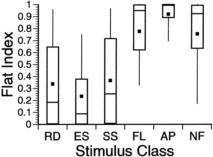
Fig. 7.
FI distributions by class. This is a box plot showing the FI distributions by stimulus class. Each of the six plots should be viewed as a sort of compact histogram with a Gaussian-shaped distribution. The solid black squares indicate the distribution means. The short horizontal lines bisecting thevertical rectangles represent the medians of the distributions. The vertical rectangle includes 50% of all index scores. The “whiskers” attached to both ends of these rectangles extend out to include 80% of the data. The six stimulus classes fall fairly neatly into two different groups. The FL, AP, and NF classes, with high FI scores, are placed in a “poor responding” group. The remaining three classes gave more vigorous responses, as reflected in their lower FI distributions.

