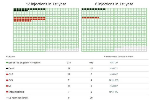
Figure 2.

HARBOR 12-month data; each dot on this icon array represents the experience of each one of a thousand patients. Benefits are coloured green, death is coloured black, harms are coloured red (when the frequency of an event—in this case visual benefit—exceeds 50% of subjects, the colour surrounds the dot rather than fills it). CVA, cerebrovascular accident; MI, myocardial infarction.
