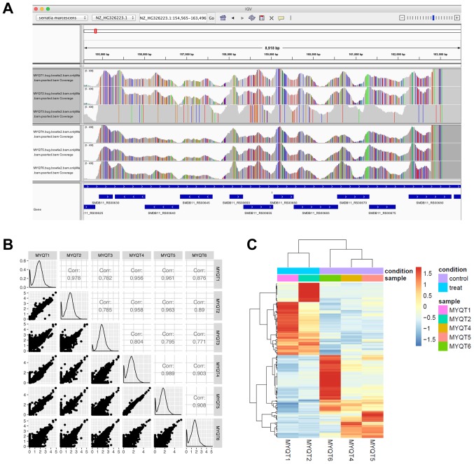
Figure 1.
IGV plot, scatter plot revealing the correlation of gene expression, and heat map of DEGs. (A) IGV plot of the genomic region that corresponds to most of the samples with a high read coverage. (B) Scatter plot revealing the correlation of gene expression. (C) Heat map of DEGs. Red indicates upregulated genes, and blue indicates downregulated genes. IGV, Integrative Genomics Viewer; DEGs, differentially expressed genes.

