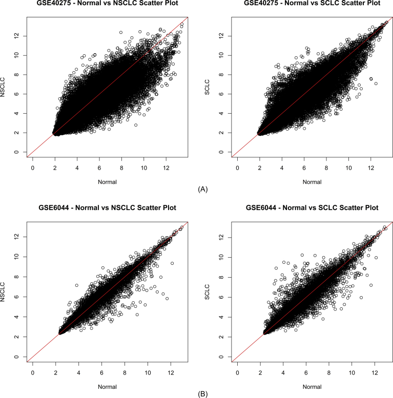
Fig. 2.
Intensity Scattered Plot showing the relationship between expression values of Normal vs NSCLC and Normal vs SCLC in datasets (A) GSE40275 and (B) GSE6044. (A) represents the comparison of expression value of genes in dataset GSE40275 between normal and NSCLC samples and between normal and SCLC samples. (B) represents the comparison of expression value of genes in dataset GSE6044 between normal and NSCLC samples and between normal and SCLC samples. x-axis represents the expression value of normal samples whereas y-axis represents the expression values of diseased samples.

