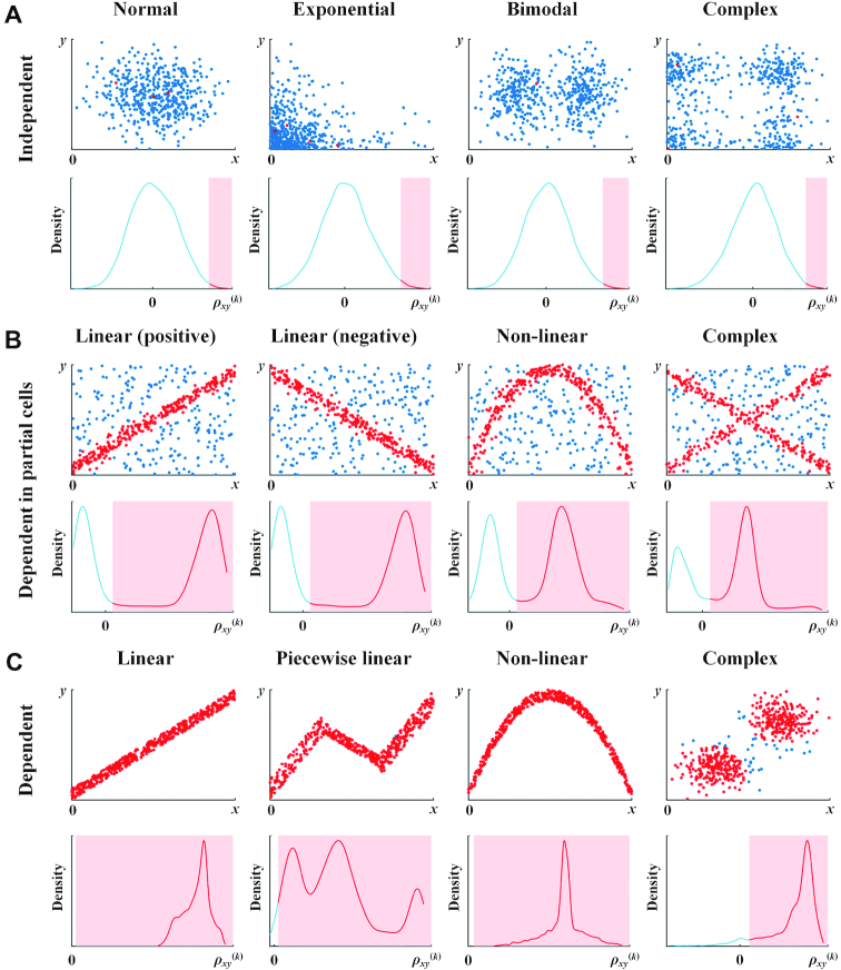
Figure 2.
Probability density functions of the statistic ρxy(k) when (A) genes x and y are independent of each other; (B) genes x and y are dependent in partial cells; (C) genes x and y are dependent in all cells. Red plots in the scatter diagrams of genes x and y represent that the statistic ρxy(k) in these plots is larger than the significant level of 0.01 and edgexy(k) = 1, which corresponds to the red area in the density function graphs. Blue plots represent that ρxy(k) in these plots is smaller than the significant level of 0.01 and edgexy(k) = 0, which corresponds to the blue lines in the density function graphs. Sample size n = 500, and nx(k) = ny(k) = 0.1n.

