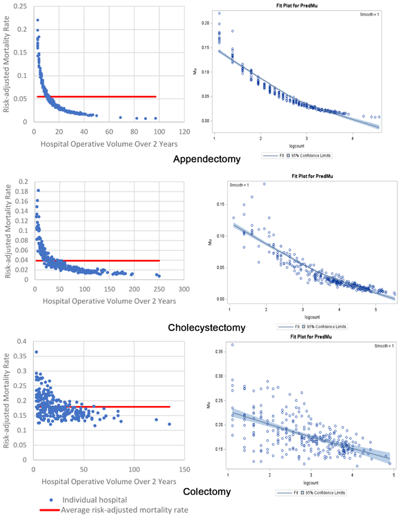
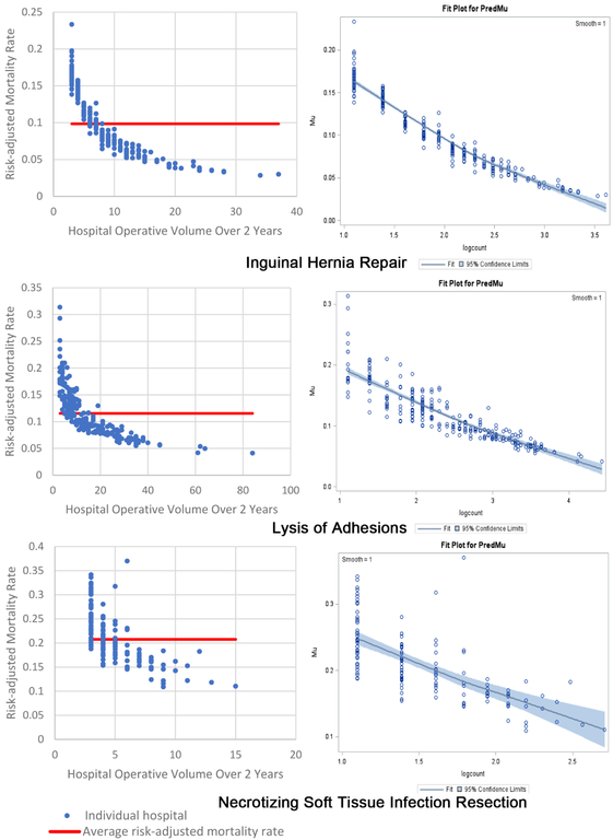
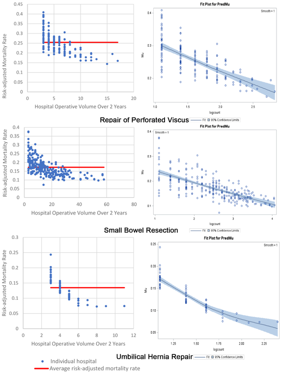
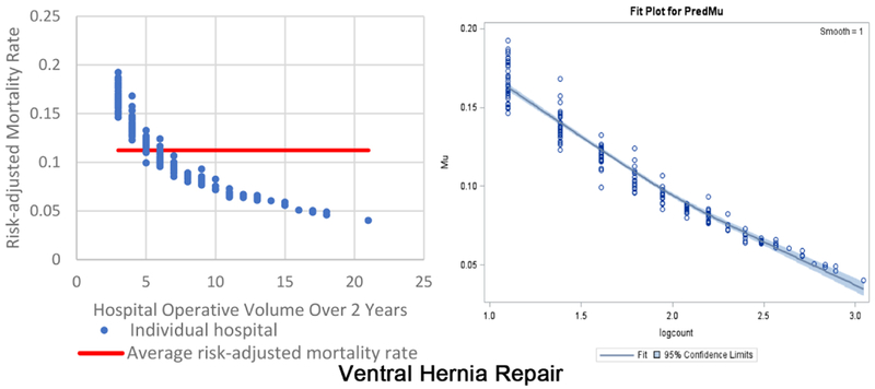
Figure 1.
Two beta fit plots for each of the 10 emergency general surgery operations. The left plot shows the inverse volume to mortality relationship: the x-axis is hospital operative volume over 2 years; the y-axis is risk-adjusted hospital mortality rate; the thick flat line represents the average risk-adjusted mortality; every blue dot represents an individual hospital. The right plot is the relationship modeled in the beta regression analyses (plots on right are titled “Fit Plot for PredMu” meaning predicted mortality): the x-axis is natural log-transformed hospital operative volume; the y-axis is risk-adjusted hospital mortality rate (in the figure labeled “Mu”); every dot represents an individual hospital.


