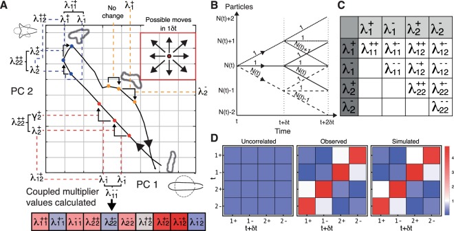
Figure 2.
MaxCal trained simulations reproduce local correlations. (A) The panel shows the trajectory of a cell in shape space over time as it shortens, splits pseudopods, commits to one pseudopod and lengthens again. Our aim is to distil this complex behavioral information into a small, quantifiable signature for this behavor in a manner that will yield similar signatures for similar behaviors. We subdivide the shape space, and register specific small events when cells cross boundaries. The elements of our signature are a series of multipliers that are determined by the rates at which particular events are observed. We introduce multipliers for two types of events: simple events, which encode the average rate of increase or decrease in each principal component of shape, and correlated events, which encode how often we see certain combinations of simple events in quick succession. For every pair of simple events there is a specific multiplier (see C). As multipliers for simple events encode the average rate at which transitions between squares occur in any particular direction, the input data for these events are any two adjacent time points, for example the first two red spots. Here we see that PC 1 has decreased, increasing the average value of the multiplier , and PC 2 has increased, thereby increasing the value of . In contrast, the first two yellow points occupy the same square, and as we are encoding the likelihood of transitions, the values of all simple event multipliers are lowered to represent this inactivity. Multipliers for correlated events involve three adjacent time points, as they encode the likelihood of any one simple event following another particular simple event. For example, the three red dots increase the value of three correlated multipliers. due to a decrease in PC 1 being adjacent to another decrease in PC 1, due to an increase in PC 2 being adjacent to another increase in PC 2, and due to a decrease in PC 1 being adjacent to an increase in PC 2. The set of yellow dots does not increase the likelihood of any such correlated events as there are no transitions in the first time step. The contributions of the whole trajectory can eventually comprise a quantitative signature in which correlated events appear more or less frequently than would be expected by chance (shown below the main diagram, with blue indicating a higher (and red a lower) likelihood. The calculation of the magnitudes of these contributions is complicated and makes up much of this paper. Note that, though the example trajectory shown here is real, the sub-divisions and time points are instructional only. (Inset) In a single timestep (1δt), a cell may be observed to move to any of the eight neighbouring squares, or may move to none of them, resulting in nine possible observed trajectories. (B) Diagram of all possible trajectories for a single shape component over time interval 2δt. The redundancy of each path is indicated by the number above. (C) Correlation parameters inferred from data. Lagrange multipliers are found corresponding to increases () and decreases () in PC 1 and increases () and decreases () in PC 2. Additional Lagrange multipliers controlling the rates at which these events occur in neighboring time-steps are shown in the table, and rates are assumed to be symmetric (i.e. event A followed by event B is equivalent to event B followed by event A). (D) Co-occurrences of transitions in neighboring time-steps are shown for simulations based only on naive probabilities (without correlations, left), for data (centre) and for simulations that include short-term temporal correlations (right). All are scaled relative to the naive rates of transition observed in the data.

