Figure 3.

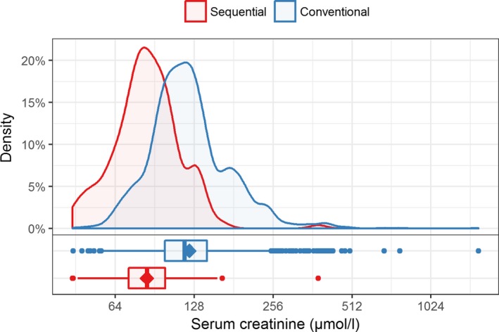
Comparison of serum creatinine levels (on log2 scaled axis) after RT between groups; the mean is indicated as diamond shape in the boxplots [Color figure can be viewed at wileyonlinelibrary.com]

Comparison of serum creatinine levels (on log2 scaled axis) after RT between groups; the mean is indicated as diamond shape in the boxplots [Color figure can be viewed at wileyonlinelibrary.com]