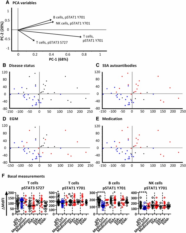
Figure 3.

PCA analysis of induced phosphorylation in PBMCs after 15 min following stimulation with IFN‐α2b. (A) Loading plot containing information about the variables for the corresponding PCA with variables given as vectors. Variables contributing little to the PCA are plotted around the centre as denoted by the grey axis, while variables having high contributions are plotted further from the axes. After initial calculation of principal components the model was recalculated with only variable explaining greater than 50% of the variance retained. This was then followed by stepwise reduction of less significant variables with low variable leverage. Groupings of samples of by PCA are shown by (B) disease status, (C) presence of SSA autoantibodies, (D) presence of extraglandular manifestations (EGM) and (E) medication status of the pSS patients. Healthy donors = blue squares, pSS patients = black circles and pSS patients positive for SSA autoantibodies, EGM, or taking medication are shown as red diamonds (C, D, E respectively). (F) Scatterplots of variables used in the final PCA. The corresponding phospho‐protein and cell type is labelled above each plot. Groups are identified on the × axis (pSS patients (pSS) and healthy donors), and further subgrouping of the pSS patients into SSA autoantibody positive (SSA+) and negative patients (SSA−), patients with extraglandular manifestations (EGM+) and without EGM (EGM−), and patients using and not using medication (medication +/−) are indicated. Statistical comparisons were made between each of these pairs as indicated by dashed lines, with black bars representing the median. The data represents 21 healthy controls and 24 patients pooled from 13 independent experiments. Comparison between pairs was conducted using an Unpaired Mann‐Whitney test with significance indicated as *≤0.05, **≤0.01, ***≤0.001 and ****≤0.0001.
