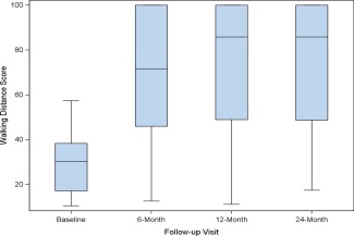
Figure 4.

Walking Impairment Questionnaire Outcomes, Box plot diagrams demonstrate WIQ‐derived walking distance (Panel A) and walking speed scores (Panel B) at baseline and follow‐up visits. The bold line denotes the median value, and the box denotes the upper and lower quartiles. There was a significant improvement from baseline at each follow‐up visit for both assessments. [Color figure can be viewed in the online issue, which is available at wileyonlinelibrary.com.]
